The Stay Club is a student accommodation company in London, and events are a significant part of their image. They asked Nago to create a new brand image specifically for events, as the original branding of The Stay Club did not really match the events.
Logo
Logo
Rather than retaining the original font of The Stay Club, which is "Gunplay," Nago decided to opt for a more contemporary font called "Stretch Pro." "Gunplay" didn't quite fit well with the overall look, and Stretch Pro imparted a more modern feeling to the entire logo.
They discussed the idea of using other names as well, but then the residents of The Stay Club could become confused about how this brand is connected to the company. Moreover, "The Stay Club" simply looked visually better than the other ideas.
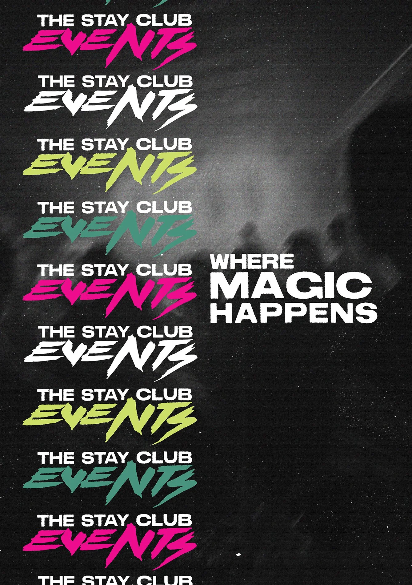
The initial idea was to retain the arrangement of the original Stay Club logo, which is the one that can be seen above in most of the experiments here, and use a brush stroke-like font to symbolize freedom or even anarchy. After a few experiments, Nago decided to use the font 'Kill the Noise'. The way the font flowed with 'The Stay Club' was seamless. With just a few tweaks, it looked like a great direction.
What is also great about this Logo design is that it works well with all the colours of the Stay Club,.

The Aesthetic
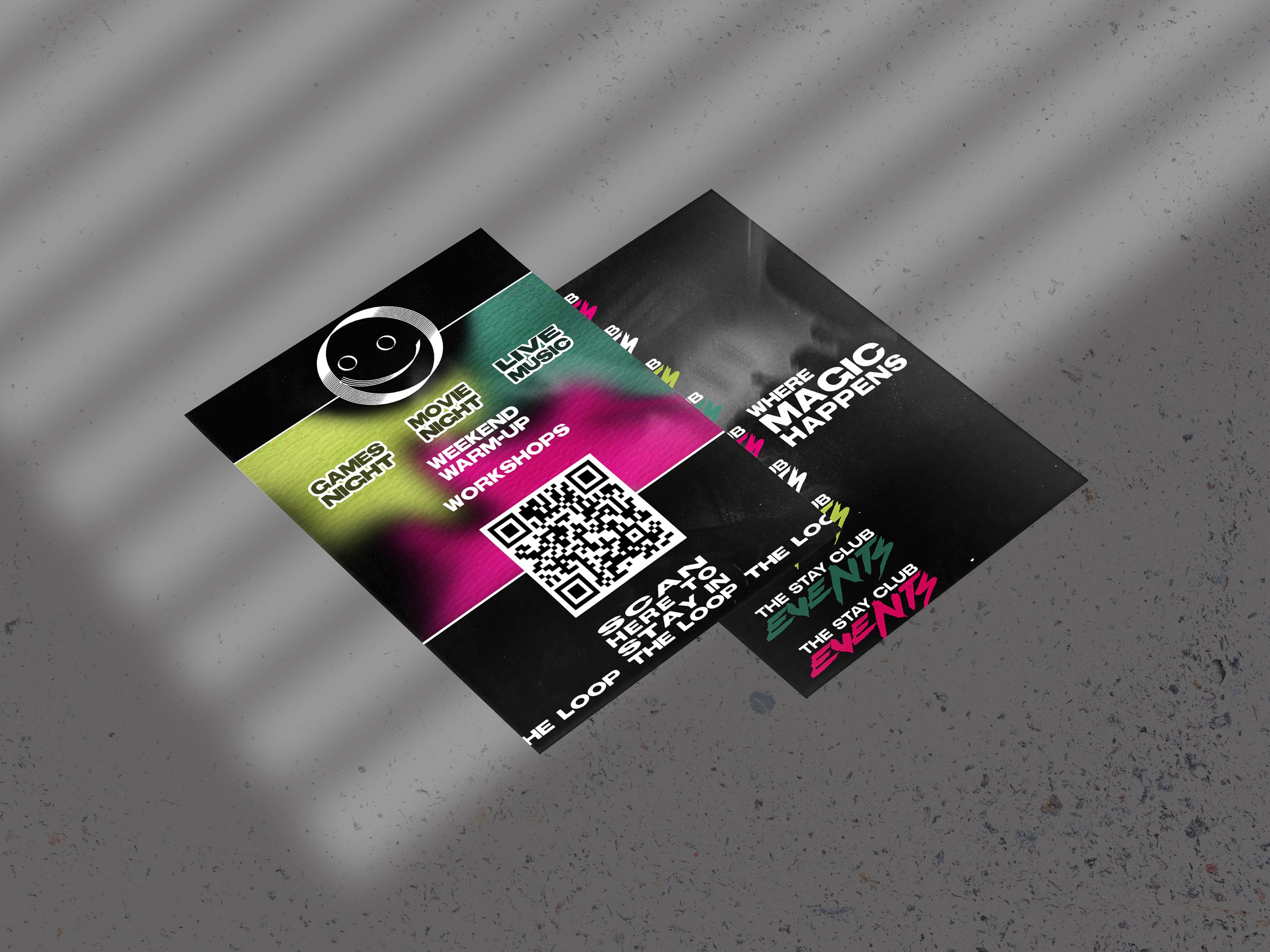
The event posters were not aligning with their intended purpose; the aesthetic of The Stay Club appeared quite childish, whereas these posters were meant to promote events for young adults. The inspiration for the new posters was drawn from rave and concert culture, featuring bold experimental titles with post-punk influences. The posters needed to capture the attention of the residents, so they were designed in a style that would resonate with their interests. The locations of most Stay Club buildings also influenced this decision, as their main properties are situated in Camden and Kentish Town – both significant hotspots for events.
Previous Posters
The previous designs had a more whimsical and a popart-y tone to the visuals.
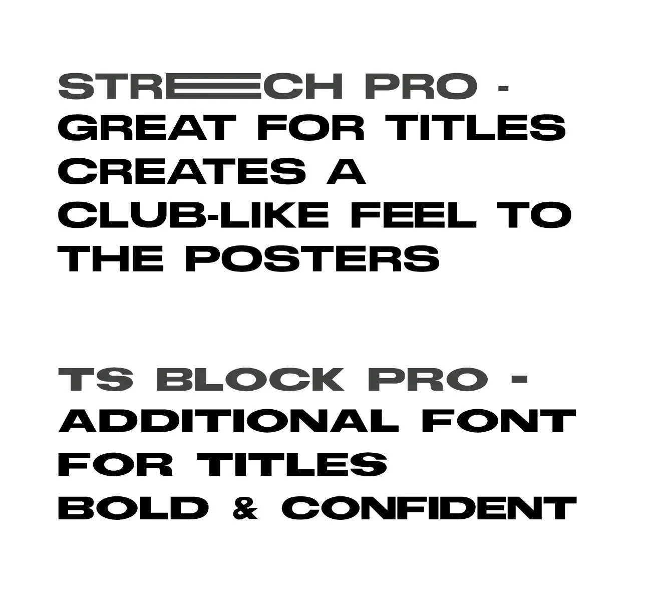
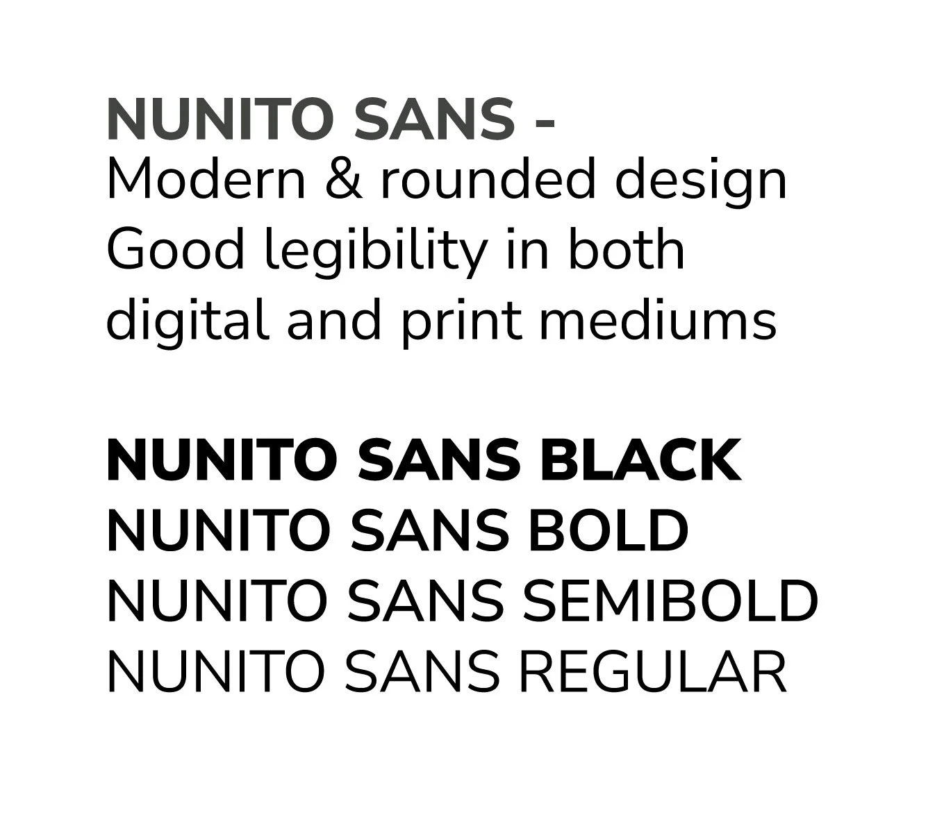
Chosen Fonts
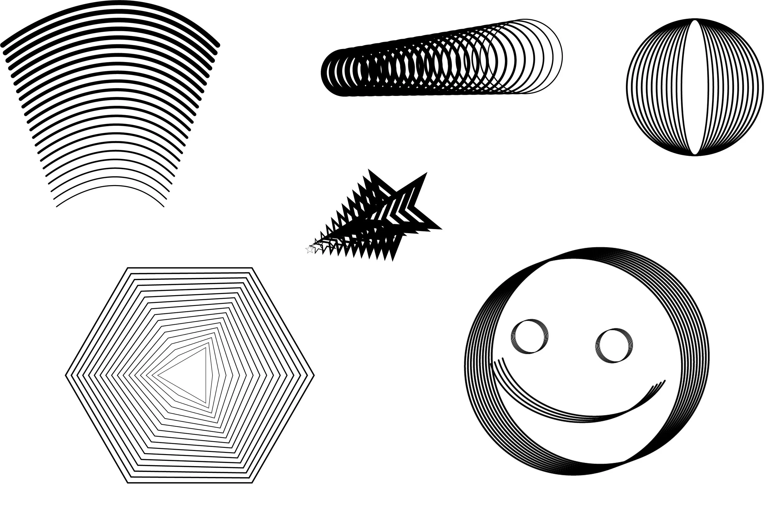
These types of geometric shapes which are inspired by techno visuals are a big part of the new branding,
Design Elements
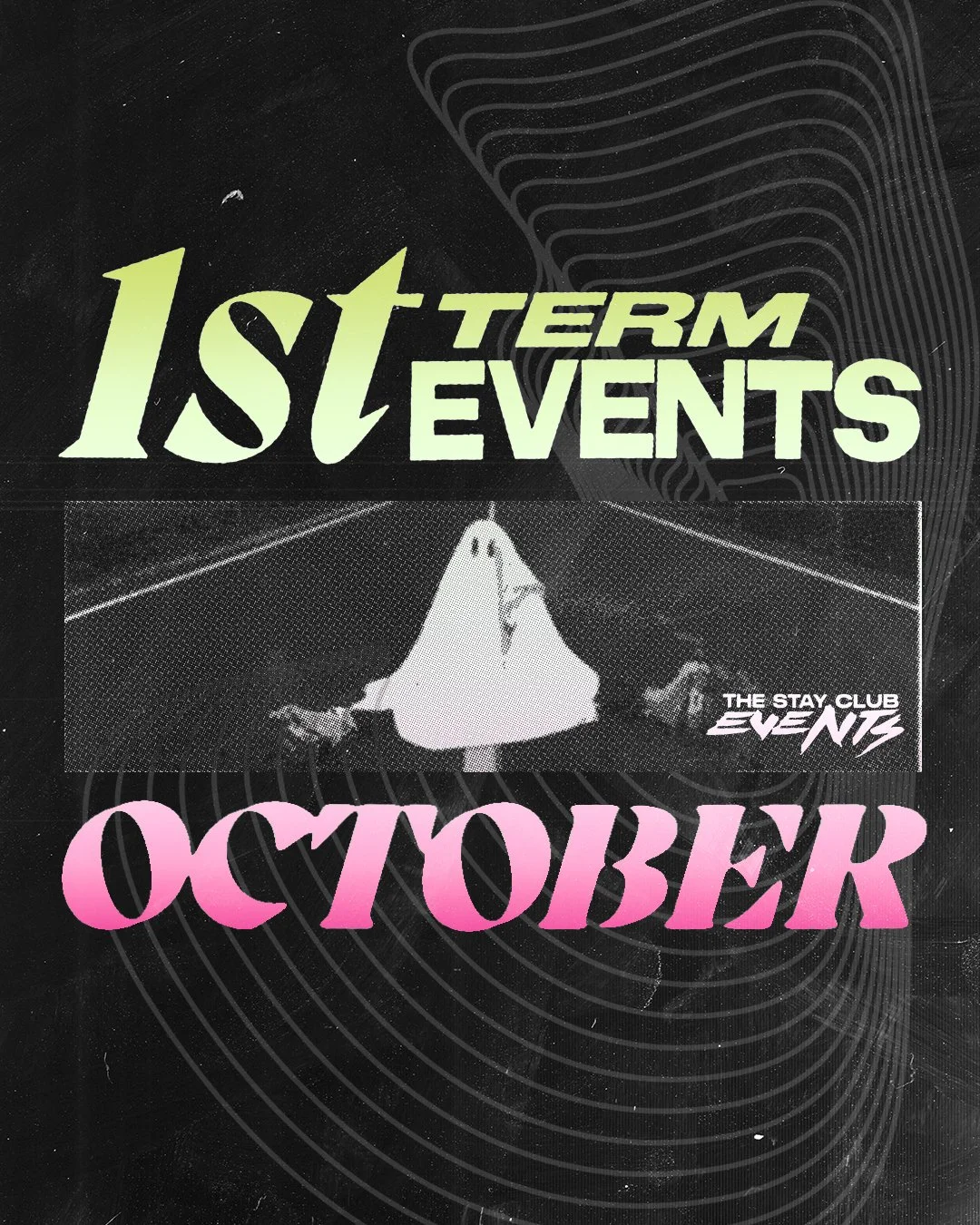
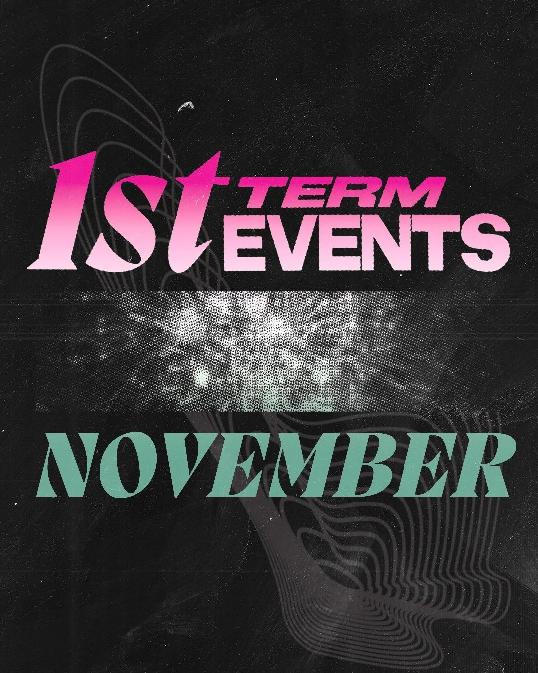
The Posters
-
The Posters -


Check out the Graphic Design page for more events posters!
Business Cards


Uniform
The initial idea was to simply place the logo on top of a dark-colored t-shirt or hoodie, as the logo itself is quite striking. However, after some consideration, Nago decided to capture the visual aesthetic of Stay Club events and position it at the back of the clothing.
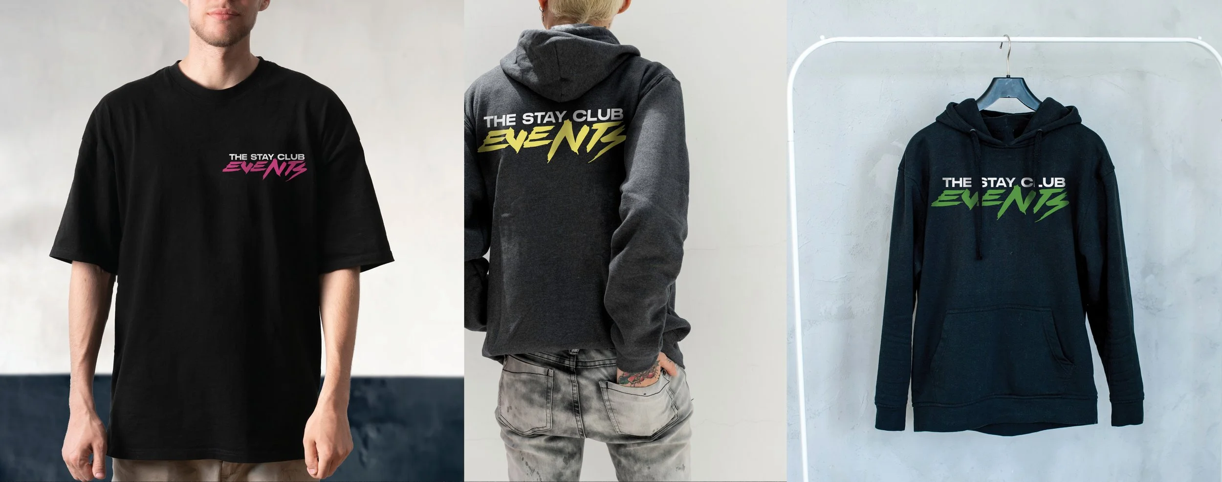
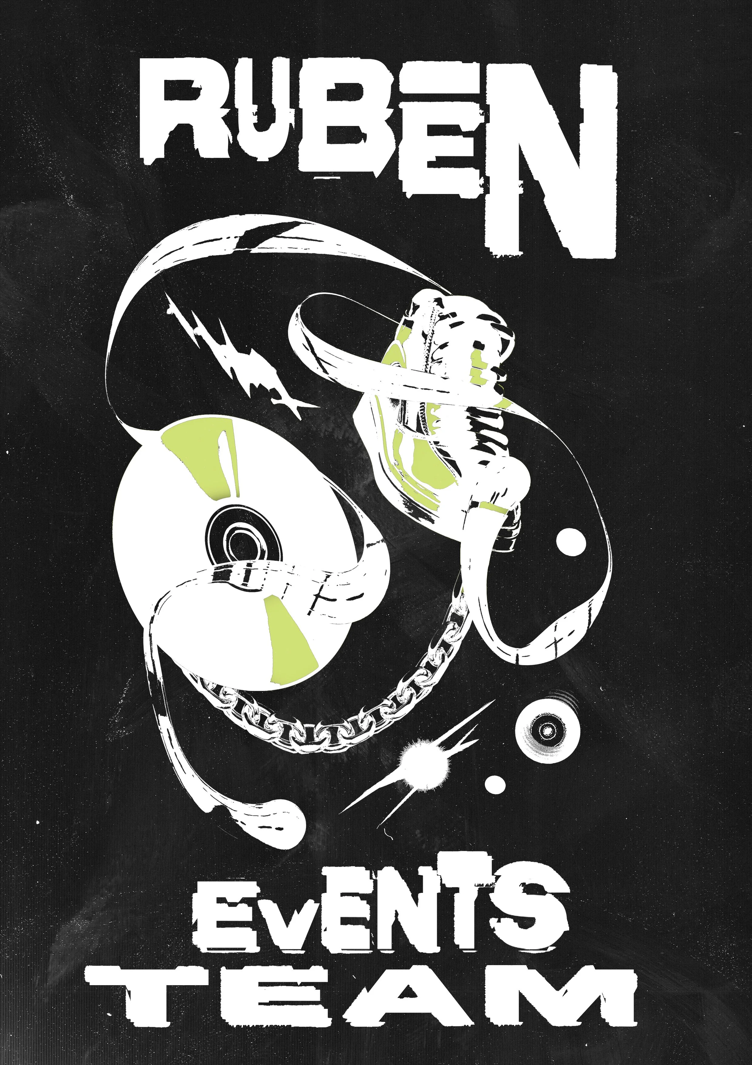
Since the events team at the time was composed of three people, Nago decided to encapsulate the essence of each person and create artwork for every coordinator.
This approach could generate more interest from residents in the events and even in the coordinators themselves, as it's their responsibility to ensure residents have a good time.
It might also open up the possibility of producing clothing merchandise for the residents.


Banner for Arrivals
In addition to all the necessary promotional materials, Stay Club has requested Nago to create a striking banner to catch the eyes of arriving students. This banner will be placed by the entrance of their accommodation buildings, so that new students will know what to expect from the events.

The banner didn't necessarily have to be filled with content; its purpose was to convey the look and feel of the events.
SOCIAL MEDIA CONTENT

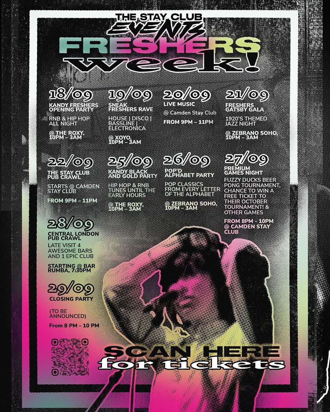


Leaflet Design - Promotional Material