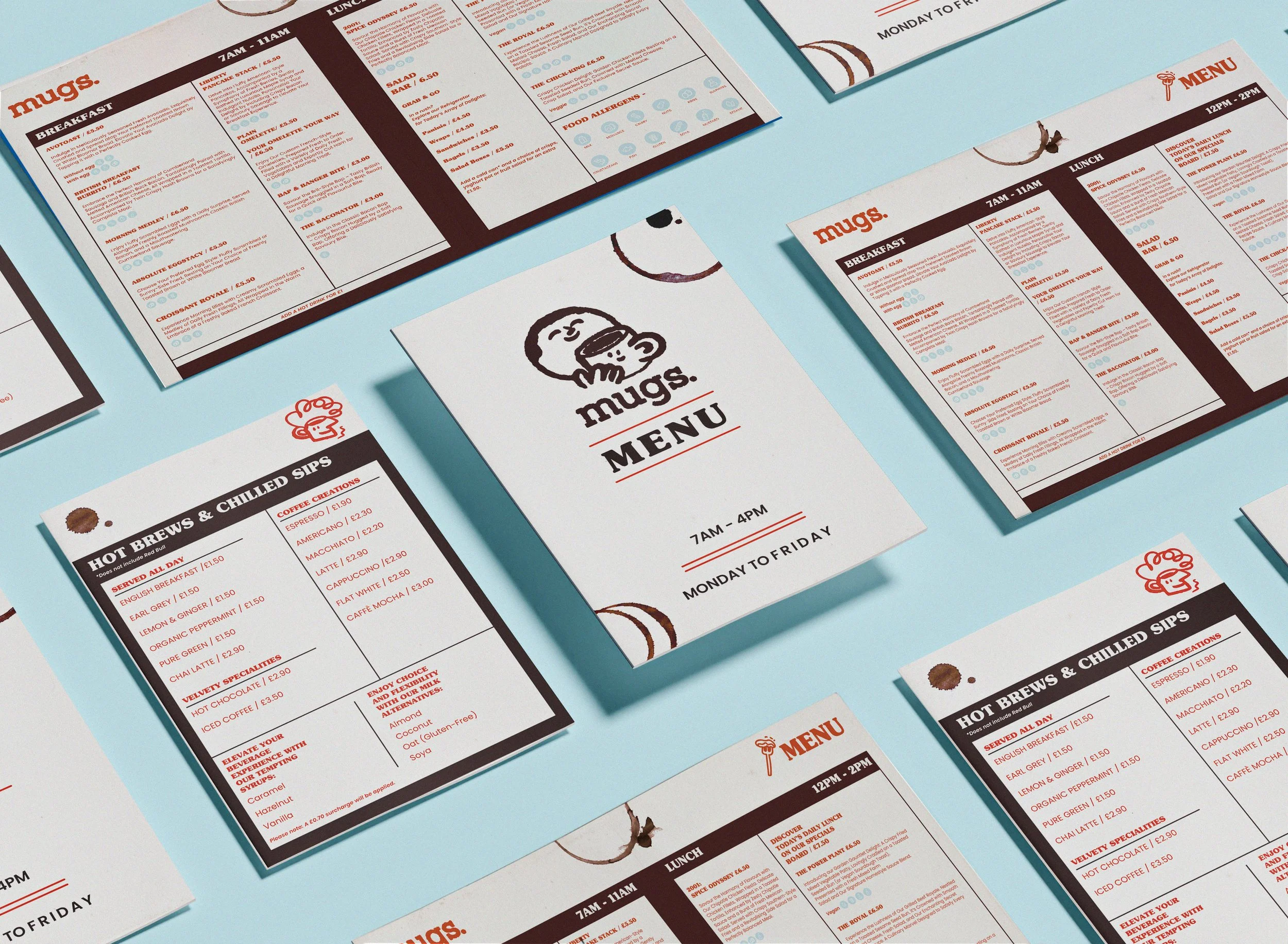
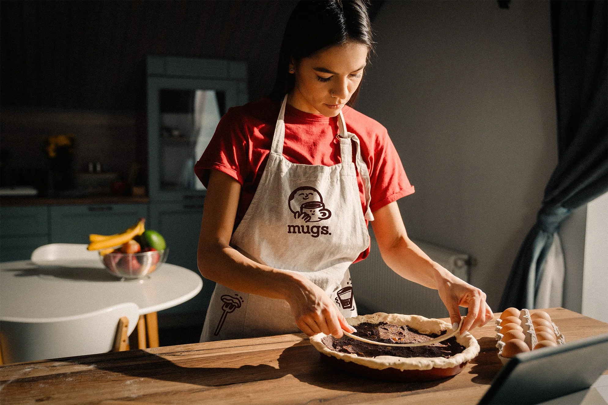
Mugs is an upcoming café/catering franchise owned by Hallmark. The goal of Mugs is to establish a cozy environment in collaboration with The Stay Club student accommodation. Their objective is to provide a welcoming space for Stay Club residents and outside visitors seeking a comfortable setting for a cup of coffee or a delightful savory dish.

EARLY BRANDING CHOICES
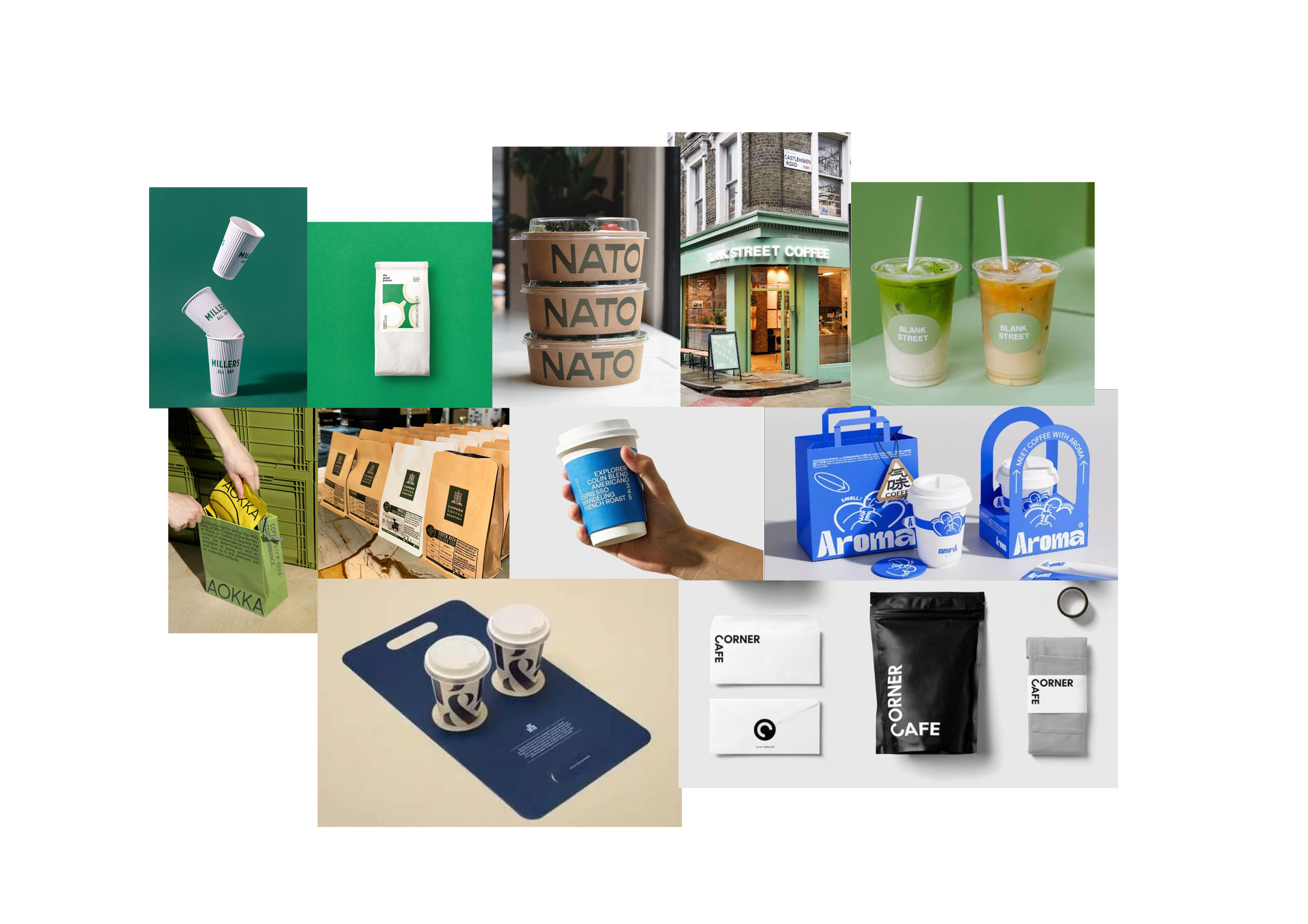
The initial idea of this brand was to have it in these trendy colours and have a more blocky & clean aesthetic. Similar to the popular coffee chain Blank Street Coffee.


The early brand names had to have some of an alliteration. Like “Sip & Savour” , “Cup & Crunch” or “Blend & Bite”. These names were interesting because one could tell that it is a company for food and coffee from the initial gaze.

THE “VIBE”
Unfortunately, the early designs didn’t really match with the aesthetic of the Stay Club or Hallmark’s vision of the brand. As the Stay Club buildings have a very rustic feeling, the branding had to match with the overall feeling of the environment.

The idea is to create cozy feeling to the cafes within the Stay Club buildings and have a distinct aesthetic through out their buildings.
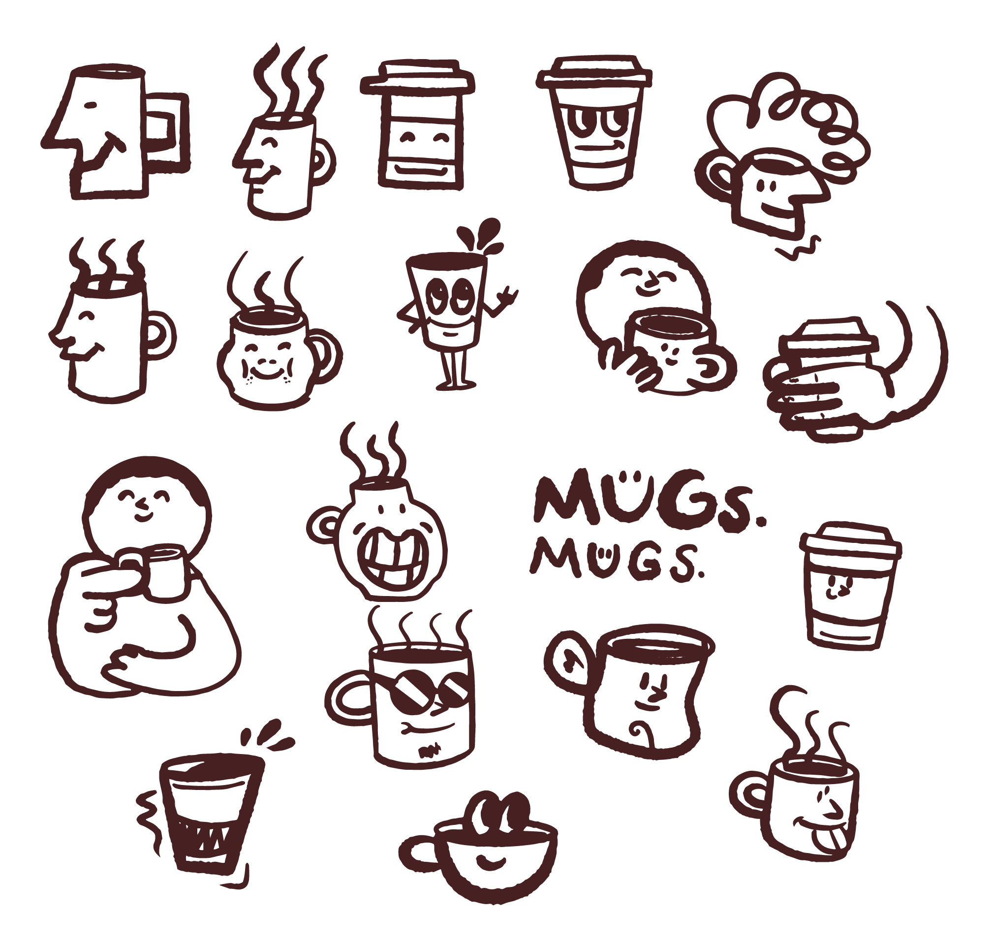
Typewriter-esque fonts with characters to give it that millenial/Gen Z touch.
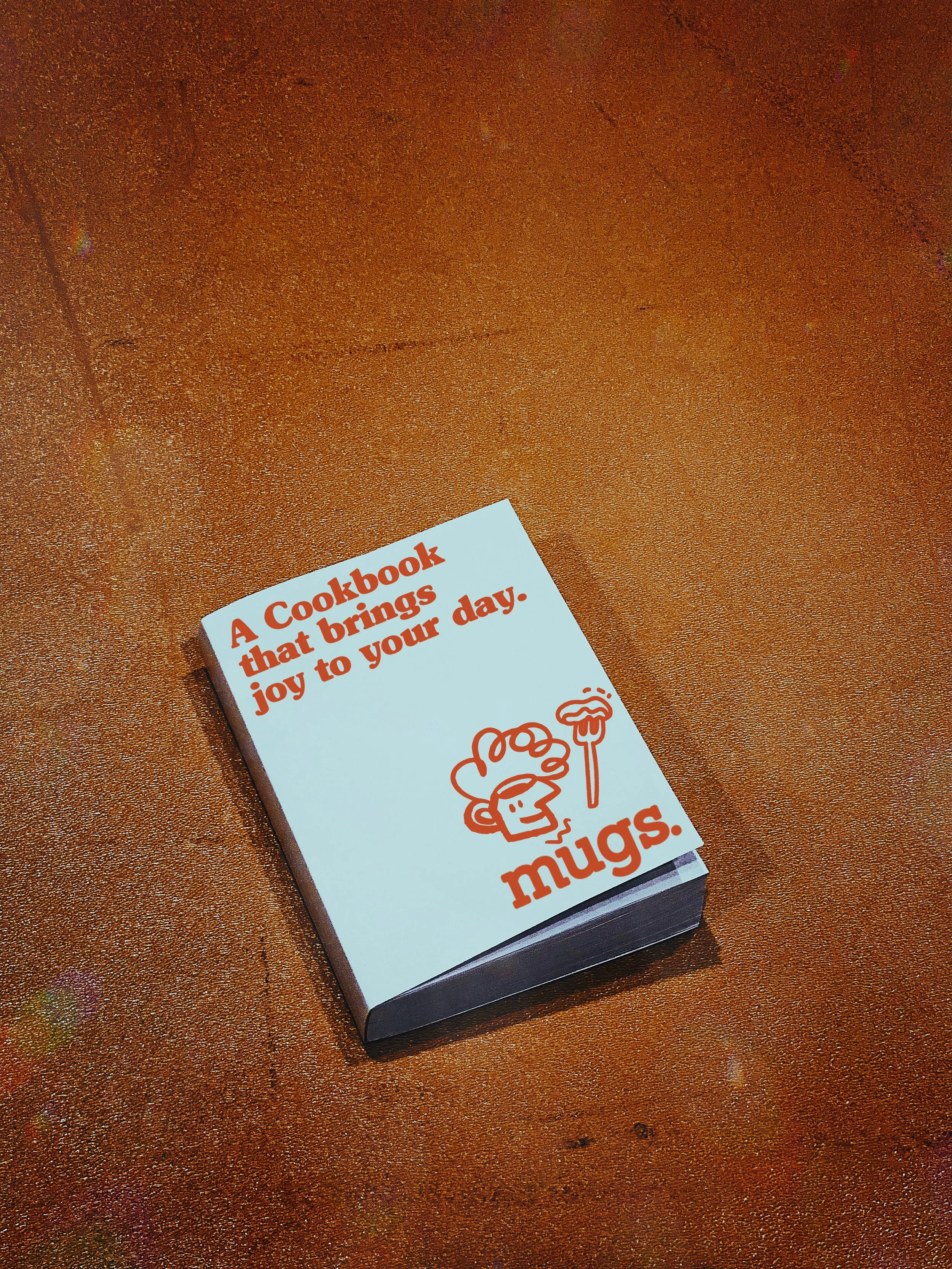
It was also an early idea to create some sort of a mascot. To match the typewriter-esque fonts, Nago decided to go for a style similar to retro cartoonists.

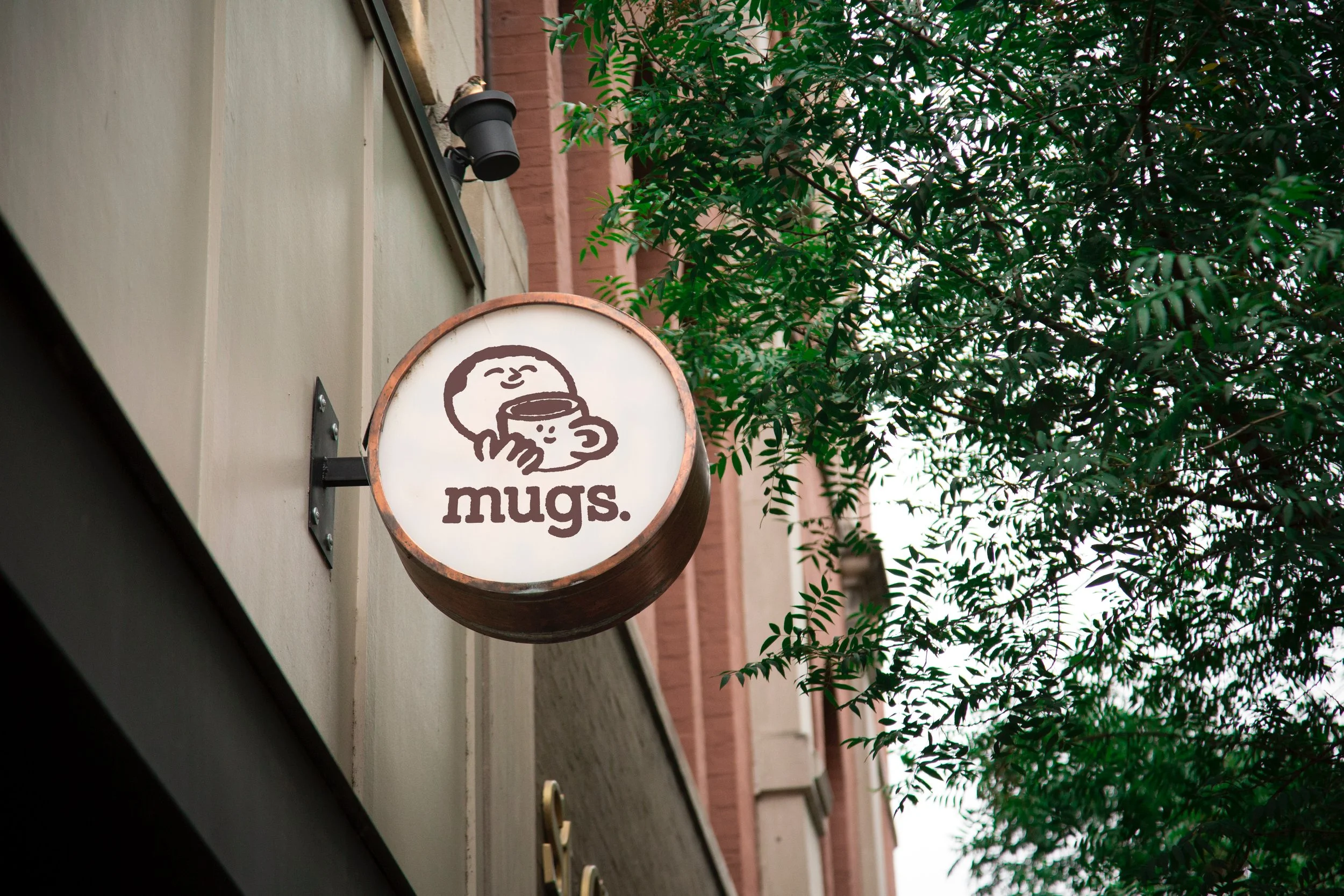
THE MUGS
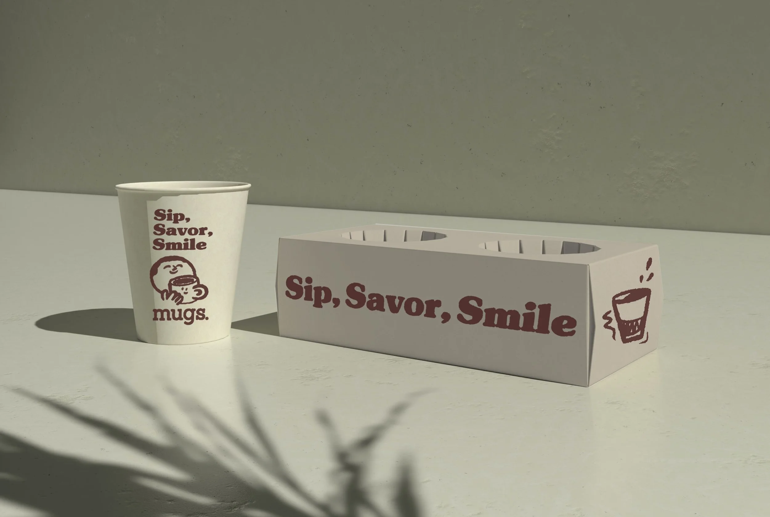
The name “Mugs” was suggested within the company, and initially, it sounded crude. However, I decided to go with it, considering that while the word 'mug' means a cup, it also refers to a face. He decided to doodle faces that look like mugs to create a double entendre.


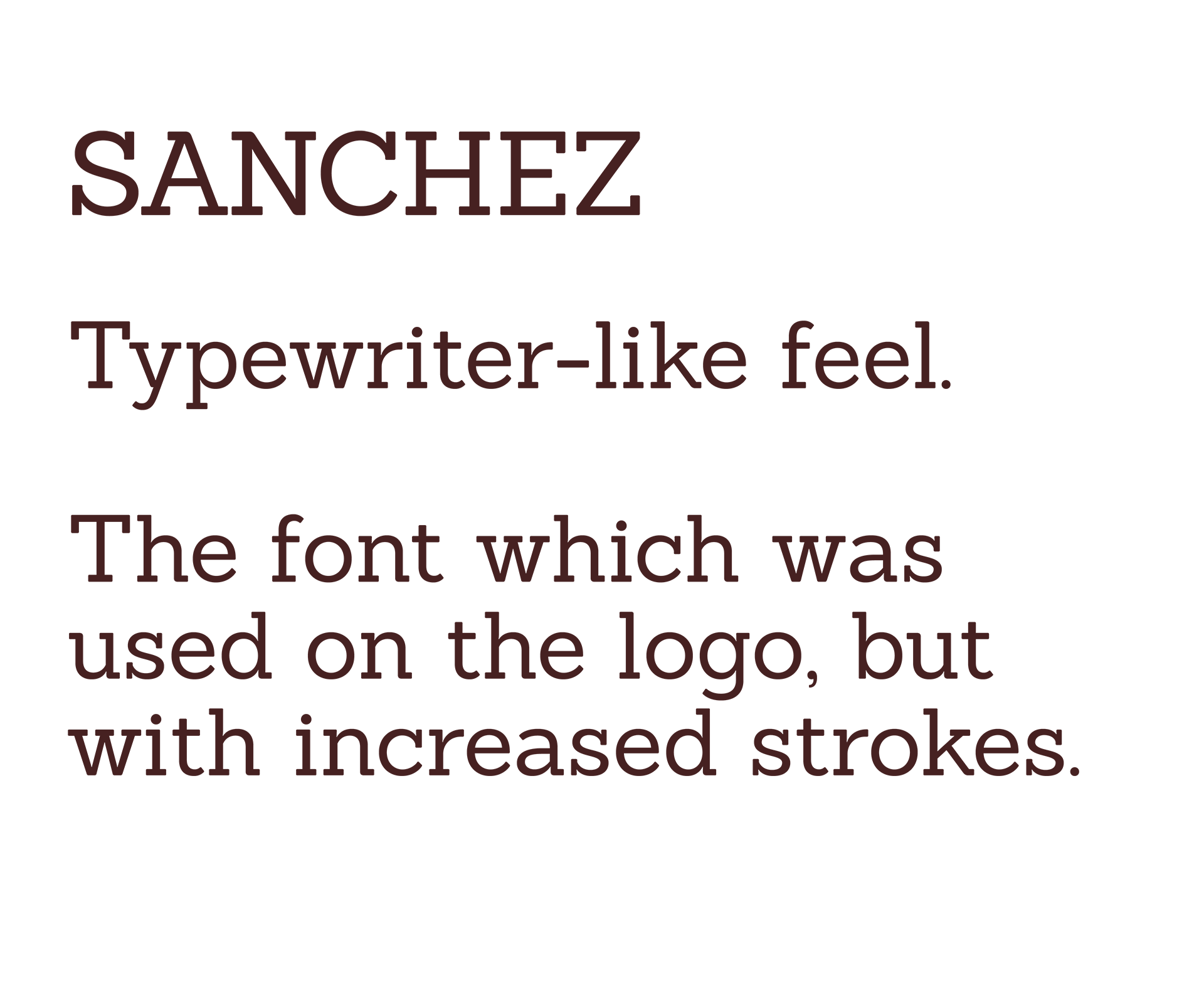
FONTS

THE LOGO
I felt that this design captures the warmth and welcoming feeling of a coffee shop.